HTML Tips and Tricks
In this post, we’ll look at few HTML tips and tricks that are not commonly known. Generally, it’s a good idea to make use of HTML native elements whenever possible before looking for Javascript alternatives.
Native HTML autocomplete
Use <datalist> element to create a native HTML autocomplete. With datalist element a list of pre-defined options can be specified for the associated input element. This also provides an autocomplete feature on the input element. Users will see a pre-populated dropdown options as they input data.
NOTE: The
listattribute of theinputelement should match theidattribute of thedatalistelement. This binds the input field and thedatalistelement.
<div>
  <h6>Native HTML Autocomplete</h6>
  <input name="countries-input" list="countries" />

  <datalist id="countries">
    <option value="Nepal"></option>
    <option value="Congo"></option>
    <option value="Combodia"></option>
    <option value="Bosnia"></option>
    <option value="Burkina Faso"></option>
    <option value="Azerbaijan"></option>
  </datalist>
</div>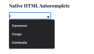
Grouped Select Lists
Create a grouped select lists using optgroup element inside the select element. Specify a label attribute in optgroup element to give a title to the group.
<select name="countries" id="countries">
  <optgroup label="Asia">
    <option value="Nepal">Nepal</option>
    <option value="Japan">Japan</option>
    <option value="Indonasia">Indonasia</option>
  </optgroup>
  <optgroup label="Europe">
    <option value="Italy">Italy</option>
    <option value="Bulgaria">Bulgaria</option>
    <option value="France">France</option>
  </optgroup>
</select>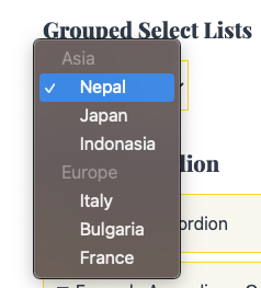
Native HTML Accordion
Create Native HTML Accordion using details and summary elements. Any child elements inside the details tag would be rendered inside the accordion. Use the summary element to give the title to the accordion. If the summary element is not specified a default text Details would be used.
<details>
  <summary>Title Text</summary>
  <p>This is a test</p>
</details>
Use the open attribute in details element to display the accordion content by default.
<details open>
  <summary>Title Text</summary>
  <p>This is a test</p>
</details>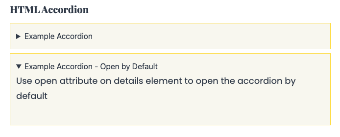
Auto Refresh using HTML
Auto refresh webpage after certain interval using meta tag and the HTTP equiv attribute in the head element.
The duration is set in seconds in the content attribute.
<!DOCTYPE html>
<html>
  <head>
    <title>title</title>
    <meta http-equiv="refresh" content="10" />
  </head>

  <body></body>
</html>
The meter element
Display quantities using the native HTML meter element without using any CSS or Javascript.
The min and max attributes defines the lower and upper bounds. If unspecified, the min value defaults to 0 and max value defaults to 1.
The low and high attributes define the low and high range of values respectively. low value must be greater than the min value and high value must be less than the max value.
The optimum value indicates the optimal value within the given range. Browser will use different color to render the meter element by comparing the meter’s value with the optimum value.
<label for="low"> Low </label>
<meter id="low" min="0" max="100" low="30" high="75" optimum="80" value="25" />

<label for="high"> High </label>
<meter id="high" min="0" max="100" low="30" high="75" optimum="80" value="95" />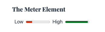
The mark element
Use the mark element to highlight a text.
<p>You are an <mark>awesome</mark> person. Cheers!!</p>
The contenteditable attribute
Set contenteditable attribute to true on any HTML element to make it editable.
<p contenteditable>
  This is an editable text. Try it here for demo. Corect this stpuiddd spelling
  mistacke.
</p>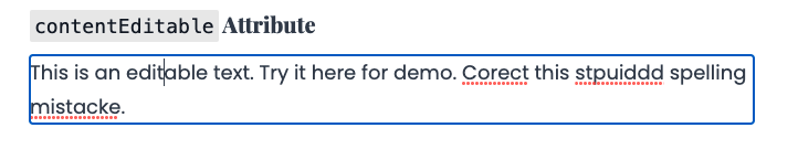
The spellcheck attribute
Use spellcheck attribute to check for spelling errors whenever possible.
<p contenteditable spellcheck>
  This is an editable text with spellcheck enabled. When you try to eidt tihs
  spellceck will be enbaled.
</p>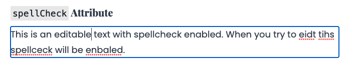
The start attribute on the ordered list ol element
By default an ordered lists starts from 1. Use the start attribute to change the default behavior and specify the starting point for the ordered lists.
<ol start="100">
  <li>Pekka</li>
  <li>Giant</li>
  <li>Minions</li>
  <li>Inferno Dragon</li>
</ol>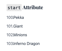
The download attribute
Use the download attribute in anchor elements to download the file instead of navigating to the file itself.
<a href="path/to/file' download>Download File</a>The Lazy Loading attribute
Lazy loading is a widely used strategy to defer loading of any resources until they are required. Lazy loading identifies resources as non-blocking and loads then only when needed. Different events can trigger lazy loadig, user interactions like scroll or navigation are some typical examples.
While lazy loading strategies can also be used to defer the loading of resources like JS, Fonts and CSS, this tutorial will focus its use on HTML elements.
Often, webpages would have images and iframes which contributes to data usage and impacts page load time. Use the loading="lazy" attribute to defer loading of images and iframes that are off-screen. These elements would load only when user scrolls near them. This approach would significantly reduce data usage and speed page load time.
<img src="image.jpg" alt="alt-text" loading="lazy" />
<iframe src="page-with-video.html" title="title" laoding="lazy"></iframe>
Input type color
Use input type color to get a native color picker.
<input type="color" />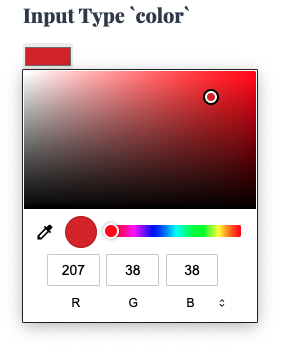
Input type date
Use input type date to create input fields that accepts a valid date from the users. It provides both the textbox and the date picker interface to make the selection.
<input type="date" />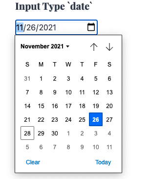
Input type datetime-local
Use input type datetime-local to create input for both date and time.
<input type="datetime-local" />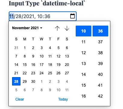
Input type time
The time input type only accepts valid time as an input. Unlike date and datetime-local it does not accept a date as input.
<input type="time" />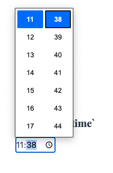
Input type week
Use week input type to create input fields that accepts a year’s week.
<input type="week" />It accepts ISO 8601 week number. We can also limit the range by specifying the min and max attributes
<input type="week" min="2020-W18" max="2020-W32" />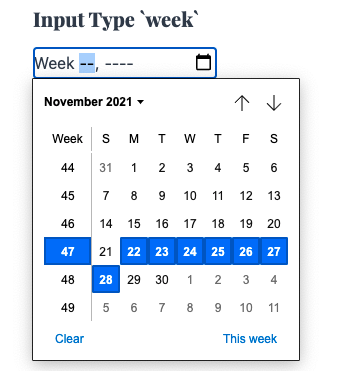
Input type range
Use the range type for the input element to create native HTML sliders. Use the min and max attributes on the input element to define the boundary values for the slider.
<label for="score">Score</label>
<input type="range" id="score" name="score" min="0" max="100" step="2" />
Input type search
For search input fields, set the value of type attribute to search to get a clear button on the input field.
<form>
  <label for="textInput">Input Type Text (Does not have clear button)</label>
  <input type="text" id="textInput" name="textInput" />

  <label for="searchInput">Input Type Search (Has clear button)</label>
  <input type="search" id="searchInput" name="searchInput" />
</form>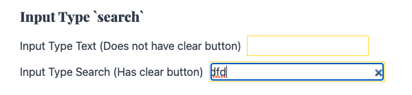
Input type reset
Clear all existing inputs in a form using a input element of type reset
<form>
  <label for="firstName">First Name</label>
  <input type="text" id="firstName" />
  <label for="lastName">Last Name</label>
  <input type="text" id="lastName" />
  <div>
    <input type="reset" value="Reset" />
    <input type="submit" value="Submit" />
  </div>
</form>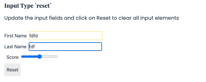
Links for Email, Call, SMS, Facetime, Whatsapp and Messenger
Use mailto: to open default email client on your device with the specified subject and body and receiver.
<a href="mailto:{receiver_email}?subject={subject}&body={email_body}>Send Email</a>Use tel: to open default phone app dialer on your device with the specified phone number.
<a href="tel:{phone_number}>Call</a>Use sms: to open default SMS app on your device with the specified phone number and message body.
<a href="sms:{phone}?body={sms_content}"> Send a SMS </a>Use facetime: to start a facetime call.
<a href="facetime://{number}">Facetime</a>Opening WhatsApp Chat
<a href="https://wa.me/{number}?text={url_encoded_text}">WhatsApp</a>

<a href="https://wa.me/5125896536?text={hello+this+is+a+test}">WhatsApp</a>
Opening Facebook Messenger
<a href="https://m.me/{username}">Facebook Messenger</a>