Build Interactive Maps in Next.js using Google Maps API
This tutorial will demonstrate how to use google Maps API and Google Places API to build interactive maps in Next.js.
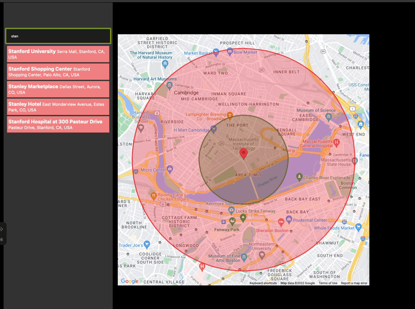
Demo
Here is a demo of what we will be building by the end of this tutorial.
Project Setup
Let’s scaffold a new Next.js app using create-next-app.
npx create-next-app@latest --ts
We will be using a package called @react-google-maps/api, which provides simple bindings to Google Maps Javascript API V3. This package lets us use google maps specific react components and hooks in our app.
npm install @react-google-maps/api
Similarly, in order to interact with Google Maps Places API, we’ll be using another package called use-places-autocomplete.
npm install use-places-autocomplete
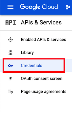
Create Google Cloud API Key
Let’s create a new key for our app from the Google Cloud Console Credentials.
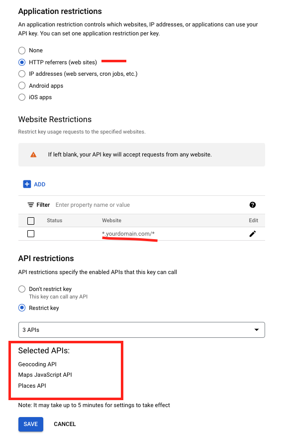
Since we will be creating a client facing application, the api key would be exposed in the browser. So it’s a good idea to add some restrictions to the API Key. For example, in the screenshot below, we are specifying that only the requests originating from yourdomain.com are considered valid requests.
Also, our application only require the Maps Javascript API , Places API and Geocoding API, we’ve enabled only these APIs.
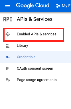
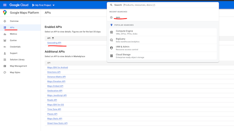
Before we could associate any of the google APIs to the key, we may have to first enable those API from
Enabled APIs & Servicestab
Rendering Map
In order to render the Map, we’d have to load the google Maps Script into our application.
Let’s use the useLoadScript hook provided by @react-google-maps/api package to lazy load the Google Maps Script.
useLoadScript expects a API Key, let’s use the key we generated from the Google Cloud Console in the previous step and access it using the next.js environment variable.
In addition to the API Key, useLoadScript hook accepts an optional libraries parameter where we could specify the array of additional google maps libraries such as drawing, geometry, places, etc.
The useLoadScript hook returns a isLoaded property which can be used to show a Loading component until the script is loaded successfully.
// pages/index.tsx

import { useLoadScript } from '@react-google-maps/api';
import type { NextPage } from 'next';
import styles from '../styles/Home.module.css';

const Home: NextPage = () => {
  const libraries = useMemo(() => ['places'], []);

  const { isLoaded } = useLoadScript({
    googleMapsApiKey: process.env.NEXT_PUBLIC_GOOGLE_MAPS_KEY as string,
    libraries: libraries as any,
  });

  if (!isLoaded) {
    return <p>Loading...</p>;
  }

  return <div className={styles.container}>Map Script Loaded...</div>;
};

export default Home;
Once the script is loaded, we can use GoogleMap component to load the actual map. GoogleMap component requires a center prop which defines the latitude and longitude of the center of the map.
We can define other properties such as zoom, mapContainerStyle, etc. Additionally, GoogleMap also accepts MapOptions, mapTypeId props and other event listeners for map load and click events e.g. onLoad, onClick, onDrag , etc.
// pages/index.tsx

import { useLoadScript, GoogleMap } from '@react-google-maps/api';
import type { NextPage } from 'next';
import { useMemo } from 'react';
import styles from '../styles/Home.module.css';

const Home: NextPage = () => {
  const libraries = useMemo(() => ['places'], []);
  const mapCenter = useMemo(
    () => ({ lat: 27.672932021393862, lng: 85.31184012689732 }),
    []
  );

  const mapOptions = useMemo<google.maps.MapOptions>(
    () => ({
      disableDefaultUI: true,
      clickableIcons: true,
      scrollwheel: false,
    }),
    []
  );

  const { isLoaded } = useLoadScript({
    googleMapsApiKey: process.env.NEXT_PUBLIC_GOOGLE_MAPS_KEY as string,
    libraries: libraries as any,
  });

  if (!isLoaded) {
    return <p>Loading...</p>;
  }

  return (
    <div className={styles.homeWrapper}>
      <div className={styles.sidebar}>
        <p>This is Sidebar...</p>
      </div>
      <GoogleMap
        options={mapOptions}
        zoom={14}
        center={mapCenter}
        mapTypeId={google.maps.MapTypeId.ROADMAP}
        mapContainerStyle={{ width: '800px', height: '800px' }}
        onLoad={() => console.log('Map Component Loaded...')}
      />
    </div>
  );
};

export default Home;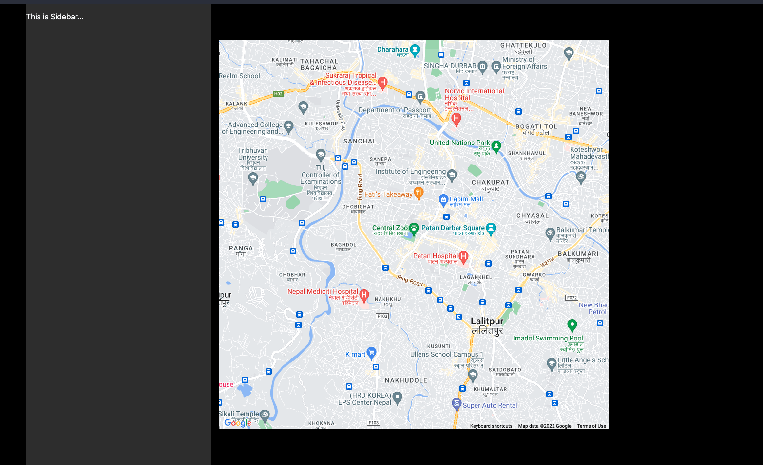
Drawing Over the Map
We can draw Markers, Rectangle, Circle, Polygon, etc. over the rendered map by passing the corresponding components as a child to GoogleMap component.
Drawing a Marker
MarkerF component provided by the @react-google-maps/api package can be passed as a children of GoogleMap component to draw a Marker over the map. MarkerF component requires a position prop to specify the latitude and longitude of where to place the Marker.
<GoogleMap
  options={mapOptions}
  zoom={14}
  center={mapCenter}
  mapTypeId={google.maps.MapTypeId.ROADMAP}
  mapContainerStyle={{ width: '800px', height: '800px' }}
  onLoad={(map) => console.log('Map Loaded')}
>
  <MarkerF position={mapCenter} onLoad={() => console.log('Marker Loaded')} />
</GoogleMap>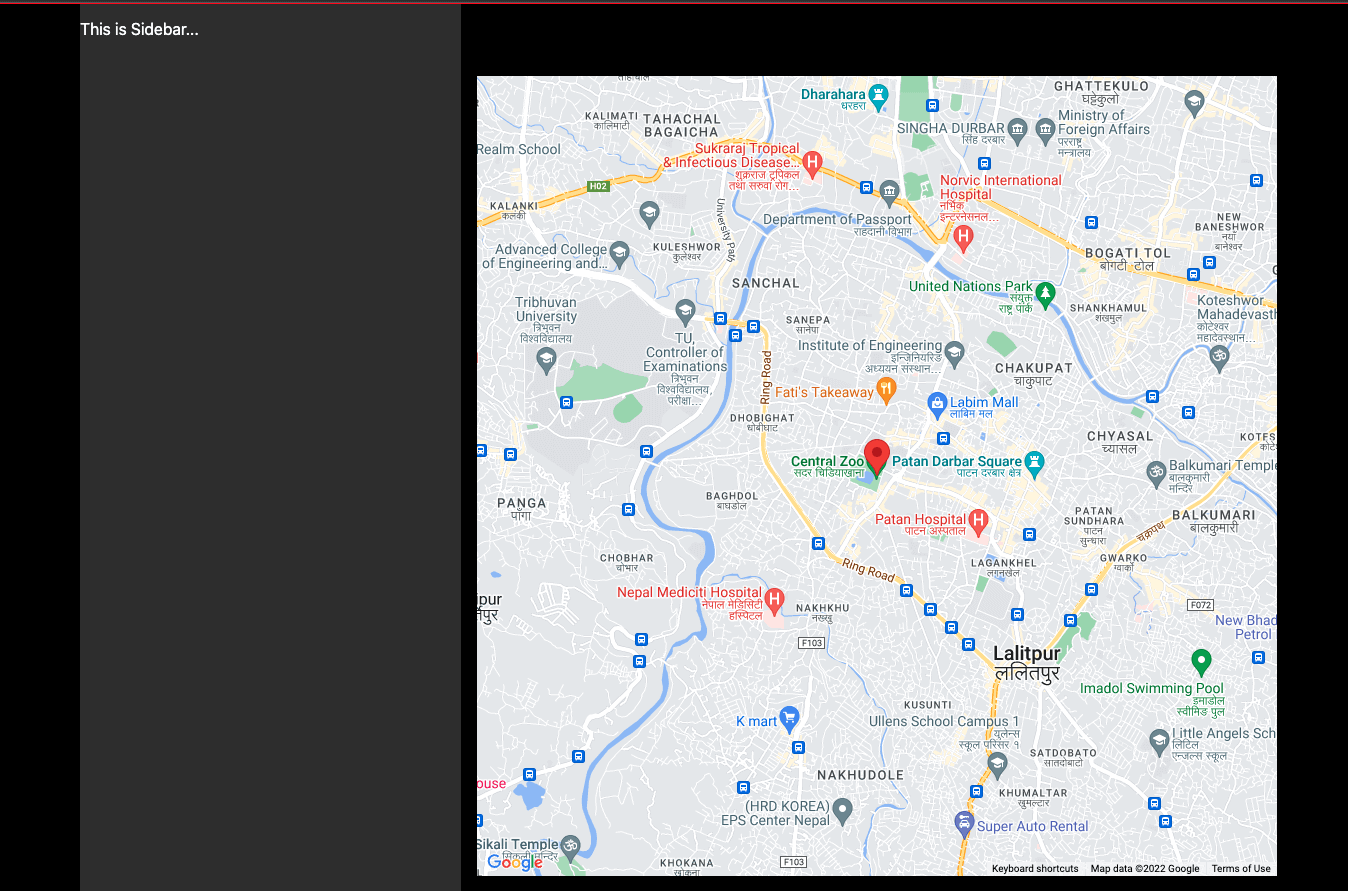
The icon of the Marker can be changed by specifying an image URL in the icon prop.
<GoogleMap
  options={mapOptions}
  zoom={14}
  center={mapCenter}
  mapTypeId={google.maps.MapTypeId.ROADMAP}
  mapContainerStyle={{ width: '800px', height: '800px' }}
  onLoad={(map) => console.log('Map Loaded')}
>
  <MarkerF
    position={mapCenter}
    onLoad={() => console.log('Marker Loaded')}
    icon="https://picsum.photos/64"
  />
</GoogleMap>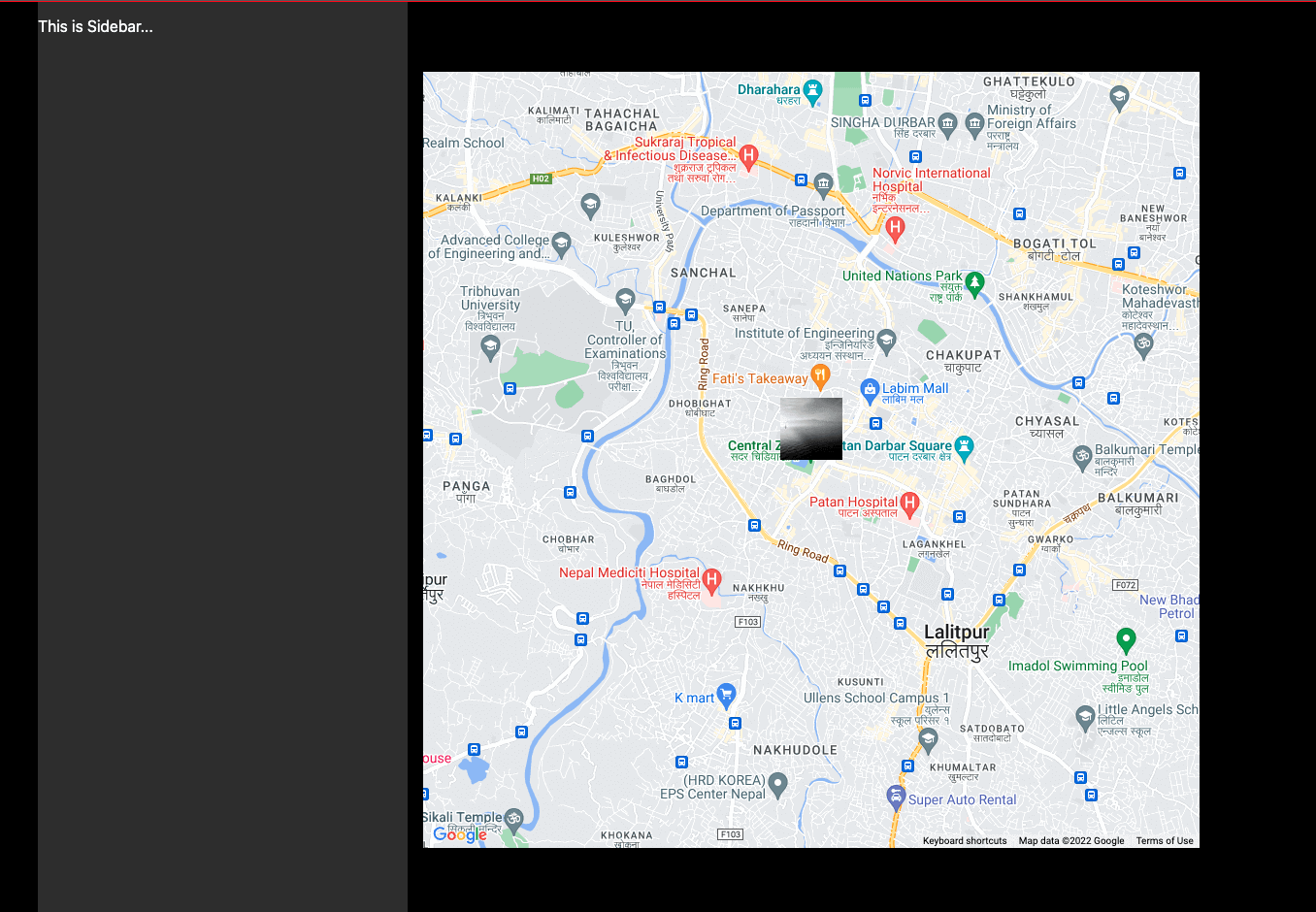
Drawing Circles
We can draw circles over the map using CircleF component provided by the @react-google-maps/api package.
Let’s draw two concentric circles with different radius over the map. We can define properties of the circle such as fill color, fill opacity, stroke color, stroke opacity, etc. using the options prop.
Here, we’ve marked the inner circle as green and the outer circle as red.
<GoogleMap
  options={mapOptions}
  zoom={14}
  center={mapCenter}
  mapTypeId={google.maps.MapTypeId.ROADMAP}
  mapContainerStyle={{ width: '800px', height: '800px' }}
  onLoad={(map) => console.log('Map Loaded')}
>
  <MarkerF position={mapCenter} onLoad={() => console.log('Marker Loaded')} />

  {[1000, 2500].map((radius, idx) => {
    return (
      <CircleF
        key={idx}
        center={mapCenter}
        radius={radius}
        onLoad={() => console.log('Circle Load...')}
        options={{
          fillColor: radius > 1000 ? 'red' : 'green',
          strokeColor: radius > 1000 ? 'red' : 'green',
          strokeOpacity: 0.8,
        }}
      />
    );
  })}
</GoogleMap>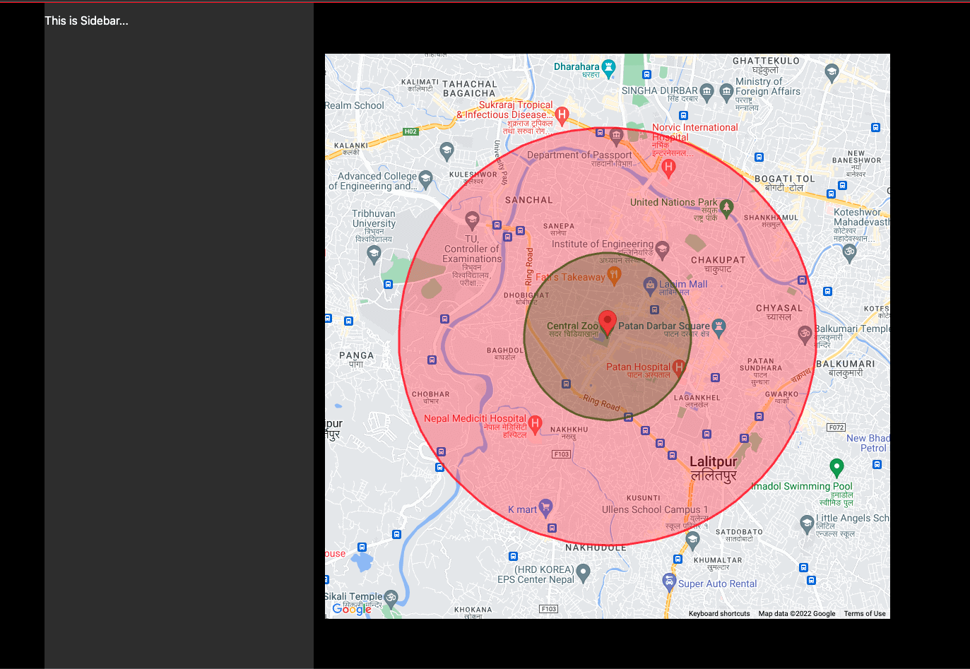
Places Autocomplete
Google Places API can be used to create a autocomplete typeahead dropdown input with suggested addresses.
We will be using use-places-autocomplete library to help build the UI component for the autocomplete input. The library is small, has built in caching and debounce mechanism to reduce API calls to Google APIs.
usePlacesAutcomplete hook can be configured with requestOptions which is the request options of Google Maps Places API
We can specify the number of milliseconds to delay before making a request to Google Maps Places API by using the debounce property. Similarly, cache property would specify the number of seconds to cache the response data from the Google Maps Places API.
The usePlacesAutcomplete hook returns a suggestions object with status and data from the Google Places API. It also provides helper methods to setValue of the input field, clear autocomplete suggestions, clearCache, etc.
const {
  ready,
  value,
  suggestions: { status, data }, // results from Google Places API for the given search term
  setValue, // use this method to link input value with the autocomplete hook
  clearSuggestions,
} = usePlacesAutocomplete({
  requestOptions: { componentRestrictions: { country: 'us' } }, // restrict search to US
  debounce: 300,
  cache: 86400,
});
We create a input field and attach a onChange handler to it which passes the user input value to the autocomplete hook using the setValue() helper method. If we get the OK status form the google places API, we render the suggested results using ul element.
return (
  <div className={styles.autocompleteWrapper}>
    <input
      value={value}
      className={styles.autocompleteInput}
      disabled={!ready}
      onChange={(e) => setValue(e.target.value)}
      placeholder="123 Stariway To Heaven"
    />

    {status === 'OK' && (
      <ul className={styles.suggestionWrapper}>{renderSuggestions()}</ul>
    )}
  </div>
);
The renderSuggestions() is a helper method which uses the data returned from the usePlacesAutcomplete hook and render the list of li elements.
const renderSuggestions = () => {
  return data.map((suggestion) => {
    const {
      place_id,
      structured_formatting: { main_text, secondary_text },
      description,
    } = suggestion;

    return (
      <li
        key={place_id}
        onClick={() => {
          setValue(description, false);
          clearSuggestions();
          onAddressSelect && onAddressSelect(description);
        }}
      >
        <strong>{main_text}</strong> <small>{secondary_text}</small>
      </li>
    );
  });
};
In nutshell, when user starts entering an address in the input field, usePlacesAutocomplete hook would make an API call to Google Places API and return a list of suggestions. We would render those suggestions as selectable list of options.
The PlacesAutocomplete component would look like following:
const PlacesAutocomplete = ({
  onAddressSelect,
}: {
  onAddressSelect?: (address: string) => void;
}) => {
  const {
    ready,
    value,
    suggestions: { status, data },
    setValue,
    clearSuggestions,
  } = usePlacesAutocomplete({
    requestOptions: { componentRestrictions: { country: 'us' } },
    debounce: 300,
    cache: 86400,
  });

  const renderSuggestions = () => {
    return data.map((suggestion) => {
      const {
        place_id,
        structured_formatting: { main_text, secondary_text },
        description,
      } = suggestion;

      return (
        <li
          key={place_id}
          onClick={() => {
            setValue(description, false);
            clearSuggestions();
            onAddressSelect && onAddressSelect(description);
          }}
        >
          <strong>{main_text}</strong> <small>{secondary_text}</small>
        </li>
      );
    });
  };

  return (
    <div className={styles.autocompleteWrapper}>
      <input
        value={value}
        className={styles.autocompleteInput}
        disabled={!ready}
        onChange={(e) => setValue(e.target.value)}
        placeholder="123 Stariway To Heaven"
      />

      {status === 'OK' && (
        <ul className={styles.suggestionWrapper}>{renderSuggestions()}</ul>
      )}
    </div>
  );
};
When user selects an address, we want to re-render the map and center it to the user’s selected address. In order to do that, we need to maintain states for lat and lng and update the state when user selects one of the auto suggested option.
Pass a custom event handler which computes the lat, lng from the selected address and updates the local state. getGeoCode and getLatLng are utility functions provided by use-places-autocomplete hook package.
Adding the PlacesAutocomplete component to the Home component.
const Home: NextPage = () => {
	  // Store lat, lng as State Variables
  const [lat, setLat] = useState(27.672932021393862);
  const [lng, setLng] = useState(85.31184012689732);
 // Add lat, lng as dependencies
  const mapCenter = useMemo(() => ({ lat: lat, lng: lng }), [lat, lng]);

	...

	return (
    <div className={styles.homeWrapper}>
      <div className={styles.sidebar}>
		{/* render Places Auto Complete and pass custom handler which updates the state */}
        <PlacesAutocomplete
          onAddressSelect={(address) => {
            getGeocode({ address: address }).then((results) => {
              const { lat, lng } = getLatLng(results[0]);

              setLat(lat);
              setLng(lng);
            });
          }}
        />
     </div>

		 ...
		</div>
	)
}
Conclusion
In this guide, we learned how we can leverage couple of lightweight packages to interact with the google maps API and the google places API to build interactive maps in Next.js
Final Code
index.tsx with Home and PlacesAutoComplete Component.
import {
  useLoadScript,
  GoogleMap,
  MarkerF,
  CircleF,
} from '@react-google-maps/api';
import type { NextPage } from 'next';
import { useMemo, useState } from 'react';
import usePlacesAutocomplete, {
  getGeocode,
  getLatLng,
} from 'use-places-autocomplete';
import styles from '../styles/Home.module.css';

const Home: NextPage = () => {
  const [lat, setLat] = useState(27.672932021393862);
  const [lng, setLng] = useState(85.31184012689732);

  const libraries = useMemo(() => ['places'], []);
  const mapCenter = useMemo(() => ({ lat: lat, lng: lng }), [lat, lng]);

  const mapOptions = useMemo<google.maps.MapOptions>(
    () => ({
      disableDefaultUI: true,
      clickableIcons: true,
      scrollwheel: false,
    }),
    []
  );

  const { isLoaded } = useLoadScript({
    googleMapsApiKey: process.env.NEXT_PUBLIC_GOOGLE_MAPS_KEY as string,
    libraries: libraries as any,
  });

  if (!isLoaded) {
    return <p>Loading...</p>;
  }

  return (
    <div className={styles.homeWrapper}>
      <div className={styles.sidebar}>
        {/* render Places Auto Complete and pass custom handler which updates the state */}
        <PlacesAutocomplete
          onAddressSelect={(address) => {
            getGeocode({ address: address }).then((results) => {
              const { lat, lng } = getLatLng(results[0]);

              setLat(lat);
              setLng(lng);
            });
          }}
        />
      </div>
      <GoogleMap
        options={mapOptions}
        zoom={14}
        center={mapCenter}
        mapTypeId={google.maps.MapTypeId.ROADMAP}
        mapContainerStyle={{ width: '800px', height: '800px' }}
        onLoad={(map) => console.log('Map Loaded')}
      >
        <MarkerF
          position={mapCenter}
          onLoad={() => console.log('Marker Loaded')}
        />

        {[1000, 2500].map((radius, idx) => {
          return (
            <CircleF
              key={idx}
              center={mapCenter}
              radius={radius}
              onLoad={() => console.log('Circle Load...')}
              options={{
                fillColor: radius > 1000 ? 'red' : 'green',
                strokeColor: radius > 1000 ? 'red' : 'green',
                strokeOpacity: 0.8,
              }}
            />
          );
        })}
      </GoogleMap>
    </div>
  );
};

const PlacesAutocomplete = ({
  onAddressSelect,
}: {
  onAddressSelect?: (address: string) => void;
}) => {
  const {
    ready,
    value,
    suggestions: { status, data },
    setValue,
    clearSuggestions,
  } = usePlacesAutocomplete({
    requestOptions: { componentRestrictions: { country: 'us' } },
    debounce: 300,
    cache: 86400,
  });

  const renderSuggestions = () => {
    return data.map((suggestion) => {
      const {
        place_id,
        structured_formatting: { main_text, secondary_text },
        description,
      } = suggestion;

      return (
        <li
          key={place_id}
          onClick={() => {
            setValue(description, false);
            clearSuggestions();
            onAddressSelect && onAddressSelect(description);
          }}
        >
          <strong>{main_text}</strong> <small>{secondary_text}</small>
        </li>
      );
    });
  };

  return (
    <div className={styles.autocompleteWrapper}>
      <input
        value={value}
        className={styles.autocompleteInput}
        disabled={!ready}
        onChange={(e) => setValue(e.target.value)}
        placeholder="123 Stariway To Heaven"
      />

      {status === 'OK' && (
        <ul className={styles.suggestionWrapper}>{renderSuggestions()}</ul>
      )}
    </div>
  );
};

export default Home;
Home.module.css
.homeWrapper {
  display: flex;
  justify-content: center;
  align-items: center;
}

.sidebar {
  margin-right: 16px;
  width: 20%;
  height: 100vh;
  background-color: #333;
}

.autocompleteWrapper {
  width: 100%;
  height: 100%;
}

.autocompleteInput {
  width: 96%;
  margin: 84px auto 0 auto;
  padding: 16px;
  display: block;
  border: 1px solid yellow;
}

.suggestionWrapper {
  margin: 0;
  width: 96%;
  overflow-x: hidden;
  list-style: none;
  margin: 0 auto;
  display: block;
  padding: 4px;
}

.suggestionWrapper > li {
  padding: 8px 4px;
  background-color: lightcoral;
  margin: 4px 0;
  cursor: pointer;
}